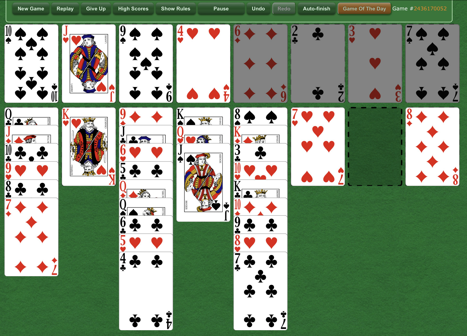
separation of the cards in play on top in Freecell game
URL: /
What would you like to see?
Hello Greenfelt folks,
I was wondering if you could perhaps make some kind of delineation between the cards in play on top and the cards filed on top. When scrolling down when you have a long stack it can be confusing which cards belong with which pile without having to count across 4 cards. This is especially true if you're trying to play quickly. "Perhaps a double frame around the done pile?" That may be a simple solution. Anyhow, we love the game & format. We play it often daily.
Cheers!
CY
Comments
Good luck. I've requested this same capability twice over the years with a different proposed solution each time with no response. Not quite sure why a polite "we're just not going to do that" has not been offered. This site is great and I'm not casting stones. Just curious as to why the guys have chosen not to acknowledge this feature request.
I can't say that this issue has bothered me, at least not very often. But I see what you mean. Perhaps a mockup of one possible solution that I'd imagine would be simple will help move the ball forward. This shows a black mask w/ 50% opacity over the suit piles. That would not only differentiate them from the free cells but also indicate that the suit piles are not interactive.

Thanks for the mock up, @DeusExMachina. I’m not sure dimming is the best indication, but I get what you meant. @ceces_place, could you explain a bit more what you mean? Space between the free cells and the foundation and the tableau? Some kind of border around one or the other?
I'm mystified as to why this capability request puzzles anyone. ANYTHING to differentiate the suit piles on the right from the free cell piles on the left will suffice. Deus' solution will work just fine. So would my suggestion of a few months back for a different color background for the suit pile cards (essentially what Deus has illustrated in his mock up). So would Cy's suggestion of a double frame or a darker border for the suit pile cards. Even a permanent vertical line between the right-most free cell card and the left-most suit pile card would serve the purpose.
imho this request is a waste of time, part of the game:_ not get muddled what you're playing
This is the only card site I play on where they are NOT separated. Usually, there is a card's distance between them.