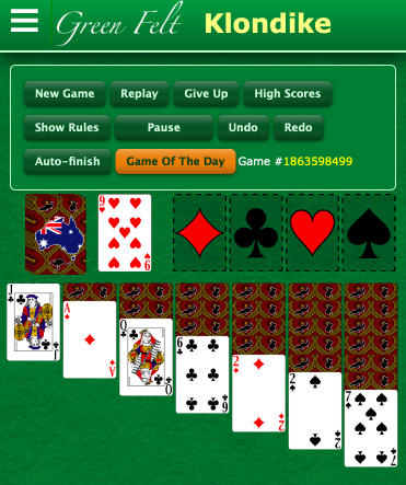
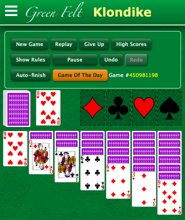
Deck is feeding from the wrong side.
Game: klondike
Game #: 480415433
Browser: Mozilla/5.0 (iPhone; CPU iPhone OS 14_4_2 like Mac OS X) AppleWebKit/605.1.15 (KHTML, like Gecko) Version/14.0.3 Mobile/15E148 Safari/604.1
Window: 667x325
JS-Version: 2021-04-28_03:49:26_-0700_2473b5a7dd5ec8633877aebf4917b8a3ea6736c1
Comments
Hi @1973 this link may help to explain what’s happening: https://forum.greenfelt.net/discussion/10828/card-deck-on-wrong-side-of-dealing
We swapped them back, but I'm liking this slightly more "centered" look better. Compare these:


with the current more "left aligned" version
Thoughts?
Yes, the centred one looks good 👍 and the stack still looks to be close enough to the edge for the left thumb to tap away at it. I’d be happy with that.
The left aligned one will probably be more pleasing to players who like the neat straight line look. It looks tidier and some will find clean lines ordered and less distracting.
Aesthetically, I prefer the centred one as it has a good balance with the two piles sitting above the columns. But also totally happy to go with the majority decision if the left aligned one is popular and preferred.
I like the more centered one, too.