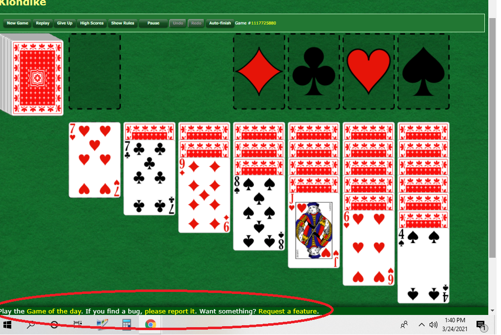
PLEASE Move the Distracting Bar on the Bottom of This Game
URL: /
Browser: Mozilla/5.0 (Windows NT 10.0; Win64; x64) AppleWebKit/537.36 (KHTML, like Gecko) Chrome/89.0.4389.90 Safari/537.36
Window: 1343x876
JS-Version: 2021-03-24_08:39:12_-0700_738678aebb7d9d95db0fee2b89e5debaaa065911
Please describe the problem in as much detail as possible:
**AAGH, don't remember this horizontal info bar being on the bottom before. ![]() ****
****
BUT whatever the case, it's very distracting - can you move it to the top? ![]() **
**


Comments
It's new. It was at the top but people were (rightly) complaining that it was too close to the undo/redo buttons so we moved it to the bottom…
I prefer the new location in principle. Alas, in practice it doesn’t function on my iPad. I suspect iOS is eating taps because your controls are down in territory reserved for the App Switcher bar.